Svetlana Motorkina, Head of Design at Friflex, shares her insights on the principles of proximity and aesthetics, explains the difference between Z-pattern and F-pattern, and more.
This is the second article in a series on user attention principles. You can read the first one here.
The Law of Proximity
When objects are close together, the brain tends to perceive them as part of the same group. For example, in the image below, we will first see two groups of elements, not 18 pandas:
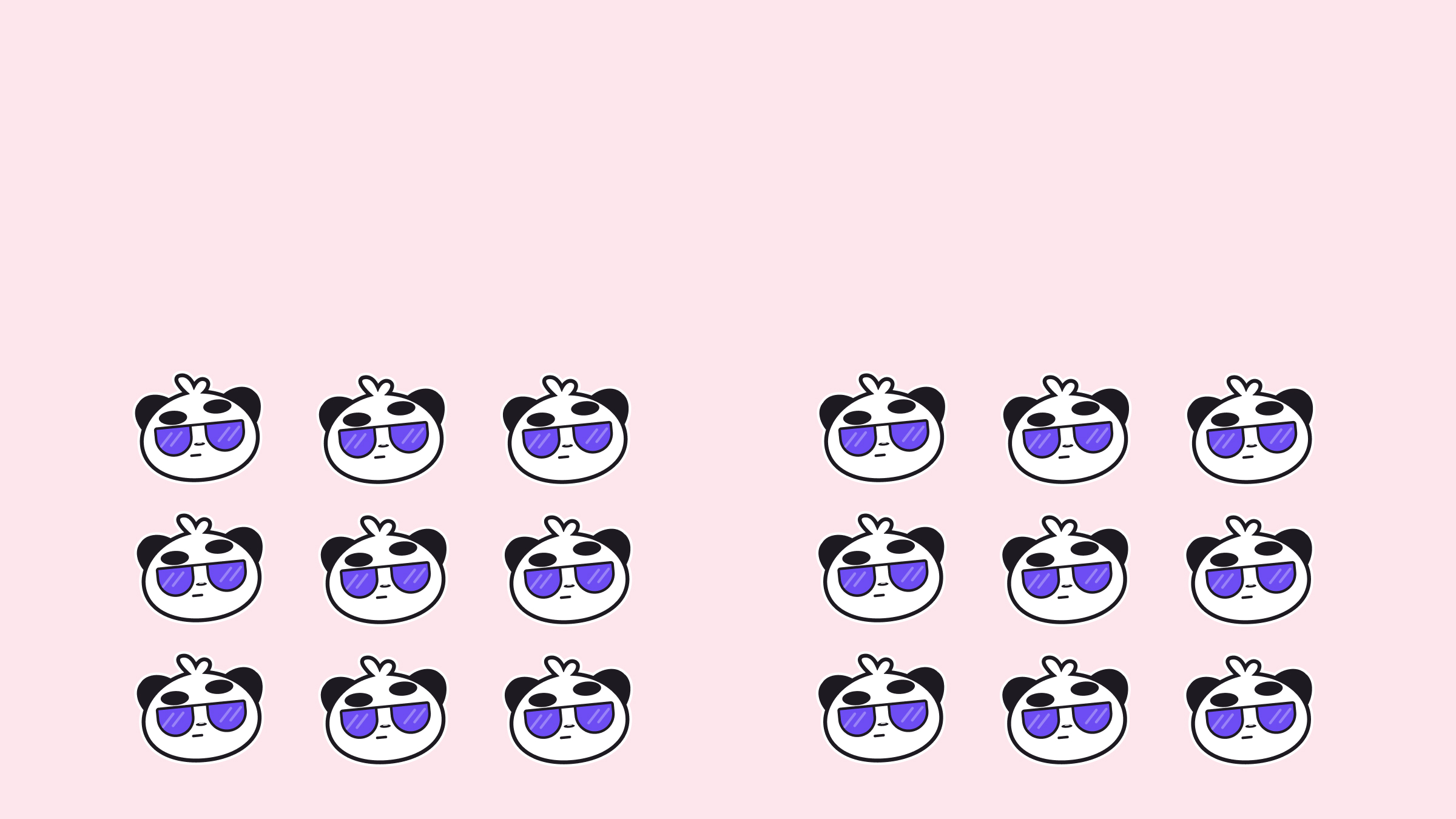
The law of proximity states: combine small fragments of information into groups, and it will be easier for the user to remember them. This is why the heading is usually placed closer to the text that follows it. This makes it easier to determine which paragraph it belongs to.
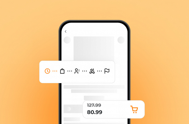
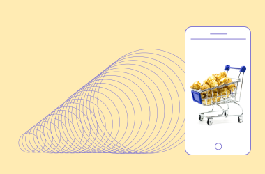
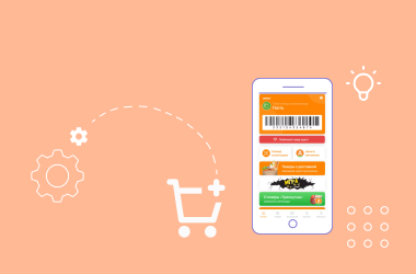
The law of proximity can also be used to visually separate personal and work data in forms. Or in the "Cart" section, where there are many details.
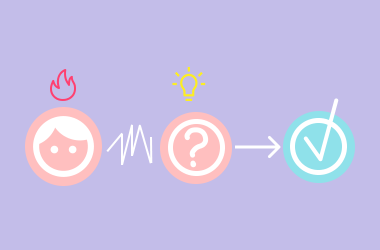
Suspense
People prefer complete forms. Our brains automatically fill in the gaps between elements to get a complete picture.
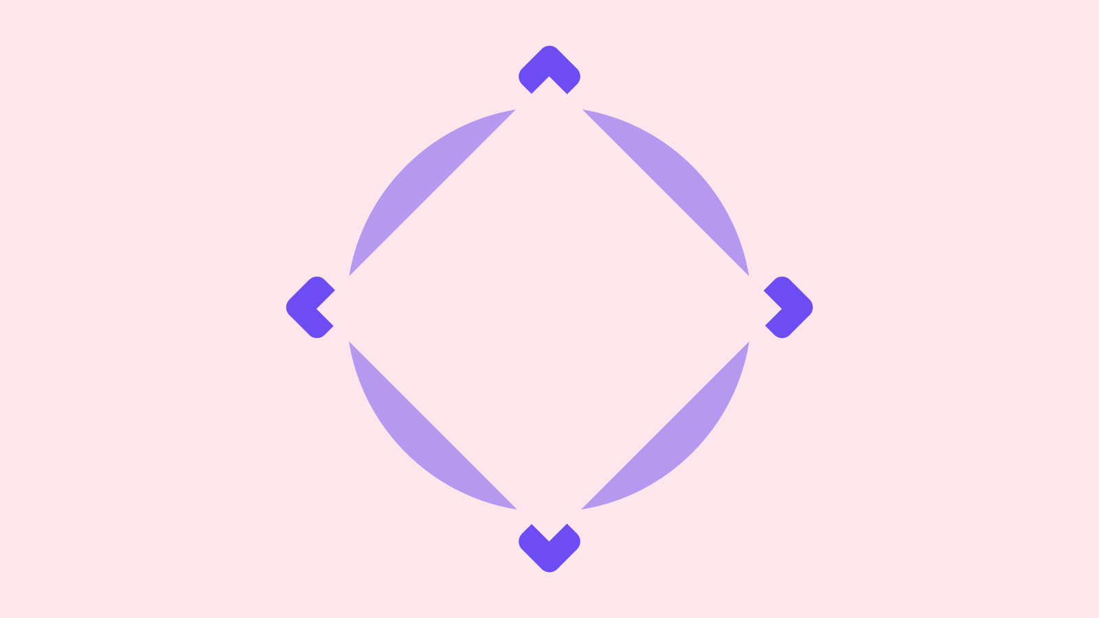
For example, in the image above, our imagination will draw a white square.
Suspense in design elements arouses curiosity, leaves room for interpretation, and creates ambiguity. The user develops an almost research interest.
Suspense is often used in logos. For example, the bitten Apple logo. A reference to the biblical story of the apple of knowledge or to the story of Newton? Or maybe just an apple? Or the Nike swoosh: the wing of the goddess Nike, the movement of an athlete, or an abstract symbol?
Laws of Aesthetics
People tend to consider aesthetically pleasing designs to be more user-friendly, and are even willing to forgive minor flaws for the sake of beauty.
Gutenberg Diagram
The Gutenberg diagram helps predict how a user's gaze will move across a page or application. Most often, the user begins their visual journey in the upper left corner. Elements located here are most likely to receive maximum attention. In this area, it is good to place the logo, heading, menu and other important details.
Then the user's gaze moves to the right — here they expect to see additional data. For example, site navigation or contact information.
Then the gaze rests in the lower left corner — the most inactive zone. It is better not to place anything important here. Finally, the user looks at the lower right corner. They are attentive again, but not as much as at the very beginning. Traditionally, calls to action are placed in the lower right corner. For example, "Buy", "Register" or "Learn More".
For those who need good design
Contact us. The Friflex team will carefully study your project and select the right solution.
Z-pattern and F-pattern
Z-pattern and F-pattern also predict how a user's gaze will move across a page. The Z-pattern is observed when viewing websites and applications where there is not much text and graphic elements play a leading role. The user views the page diagonally, starting from the upper left corner and ending in the lower right.
On websites with a lot of text and few graphic elements, you can often notice the F-pattern. The gaze from the upper left corner slides down and to the right, then down again and moves to the right again, forming the letter F. Therefore, news sites often try to place the headlines of the most important articles in the upper left corner and on the next line.
Serial position effect
People remember the first and last elements in a sequence best. So, the most important information is best placed at the beginning or at the end.
Guided by this principle, online stores often place popular products or special offers at the beginning of the catalog. And social networks place important messages and advertising at the beginning of the news feed.
Together, proximity, suspense, aesthetics, the serial position effect, the Gutenberg diagram, as well as F- and Z-patterns, help to direct the user's attention in the interface so that they can easily achieve their goals.