Creating an order confirmation page that goes beyond a mere "Thank You for Your Purchase" is crucial. After a user navigates from the homepage to their cart, fills out necessary forms, and completes the purchase, they are greeted with the order confirmation page—a page that too often features just the standard, uninspired “thank you” message.
At Friflex, we see the order confirmation page not just as a formality but as an opportunity. Here’s how you can enhance it to add value for your users, connect with your customers, foster loyalty, and increase profits.
Be informative
Appropriate Copywriting
First and foremost, the order confirmation page should be informative. To achieve this:
- Maintain your tone of voice and the way you usually communicate with your audience. The text on the order confirmation page should not stand out from how you normally engage with your audience.
- Organize information into sections. This can be done using headers, subheaders, spacing between text blocks, or visual elements. Structuring helps highlight important points and creates a sense of organization and reliability.
Responsive Design
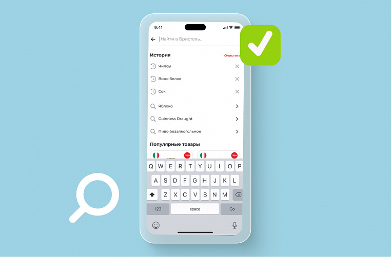
Over 90% of internet users are on mobile phones, making it essential for the order confirmation page to display well across different screens.
Attention to Loading Time
Endless loading on the order confirmation page can stress users out. Avoid overloading it with unnecessary elements, use caching, and remove any redundant code.
Essential Order Information
Imagine hitting the "Buy" button and the payment goes through successfully. But the order confirmation page is vague. The title "Order #12345" doesn't clarify whether the order has been placed. It's unclear how or where to track it. The range of emotions can vary but it's likely from doubt to confusion.
A well-designed order confirmation page, on the other hand, instills confidence in the buyer, perhaps even anticipation but not anxiety. Here are some elements that can help eliminate doubts:
- A tick or a message confirming that the order has been placed.
- Order number.
- Order details: list of purchases, quantity of goods, cost, delivery method, and a tracking number to follow the shipment.
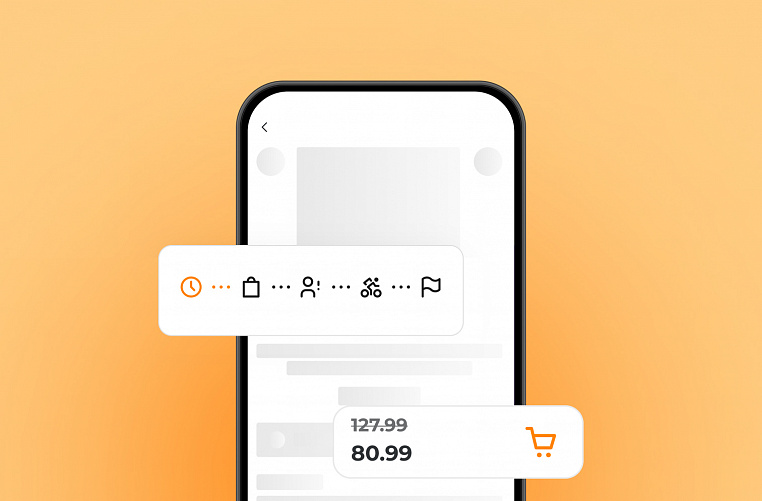
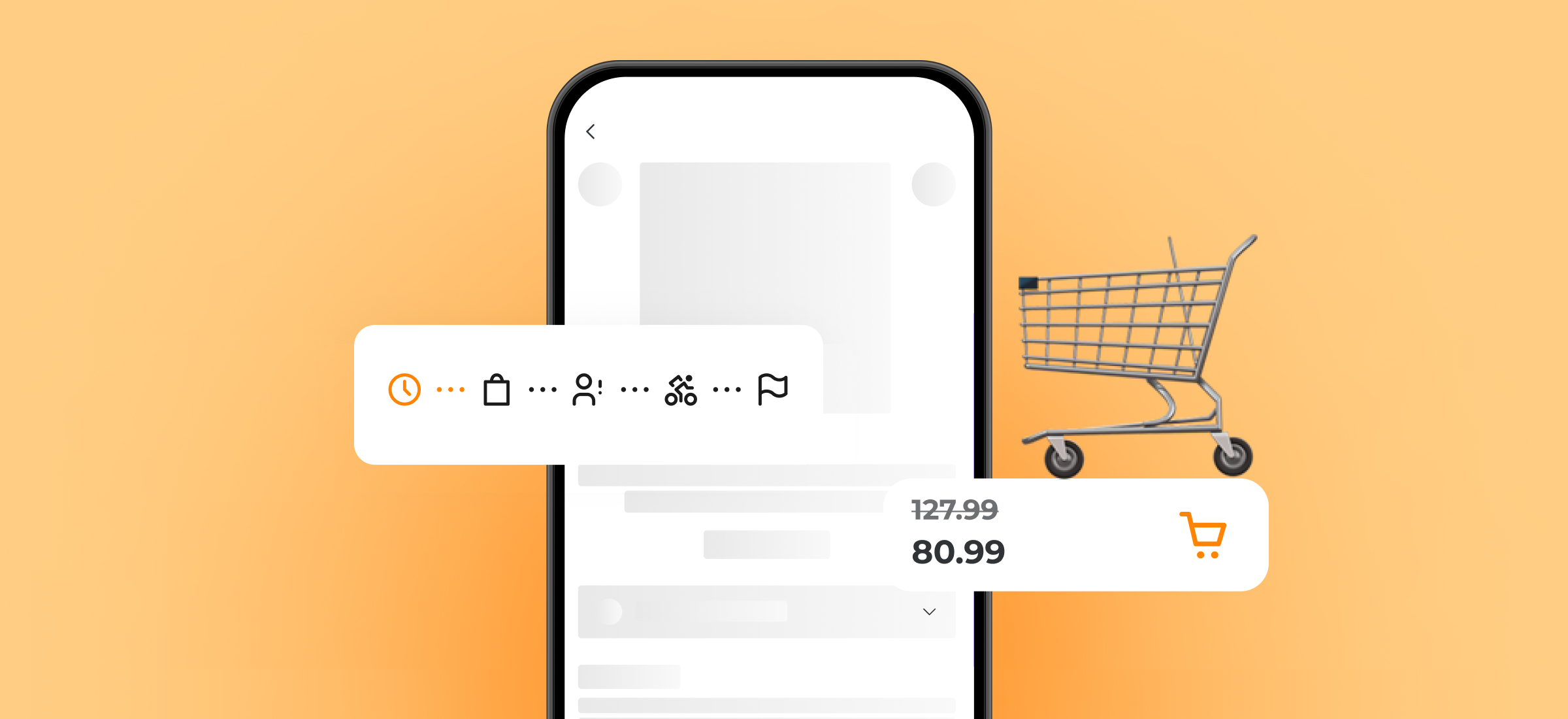
- Delivery information: timelines, address, stages. Stages can be represented with icons, as in the Dixy mobile app—clock for assembly pending, warehouse for assembly, package for delivery, flag for delivered.
Upsell Block
The order confirmation page can include elements that encourage users to make future purchases.
An upsell block suggests additional products or services: accessories and components, items from the same collection, products from related categories, items with similar features, popular items in the category, and options for the same item in different colors or modifications.
For example, if you bought a coffee machine, the upsell block will remind you that your happiness isn't complete without exquisite coffee beans, beautiful cups, and gentle cleaning agents.
If you ordered vegetables, the system might suggest similar products. Yellow tomatoes with red ones of a different variety, lactose-free milk with similar sour cream and yogurt, banana cake with chocolate cookies.
Together Forever
The order confirmation page is the final step in the purchasing process, but ideally, the relationship with the user doesn’t end there. Here are some elements that can help you continue engaging with the user after they've hit "Buy."
Subscription to Social Media or Newsletters
Subscribing to social media and newsletters allows you to gently remind customers about your brand after they've made a purchase. The subscription form is usually located at the bottom of the page, after the main order information.
In exchange for subscribing, you can offer discounts, exclusive promotions, early access to sales, as well as articles, tutorial videos, or courses. If the client is logged in, it's better to check whether they're already subscribed to the newsletter to avoid being intrusive.
Creating an Account
There are several reasons to encourage a customer to create an account after confirming an order. First, it reduces the number of abandoned carts since registration isn't required before placing an order. Moreover, offering to create an account on the order confirmation page can increase conversion: users who have already placed an order are more likely to create an account, perhaps to track its progress.
A/B Testing
To improve the performance of the order confirmation page, consider A/B testing. This involves showing two versions of the same page to different user groups simultaneously. For instance, one group could be offered a 10% discount on their next purchase, while the other group is not offered anything. Then, see which version leads to more repeat purchases.
Conclusion: The order confirmation page should not be underestimated. It's a prime opportunity to make a positive impression on the buyer. An effective order confirmation page can help increase repeat sales, enhance customer loyalty, and improve brand image.
Friflex's portfolio includes over 80 mobile apps and websites for retail. If you have a project you'd like to discuss, please fill out our brief. We'll give it the same careful attention we give to every element of our digital products' order confirmation pages.