#Инструкция 01.07.2025
Как работает продвижение мобильных приложений в сторах
Описание, видео, локализация и другие важные вещи


E-bike rental app

App for a retail network, loyalty card, promotional catalog

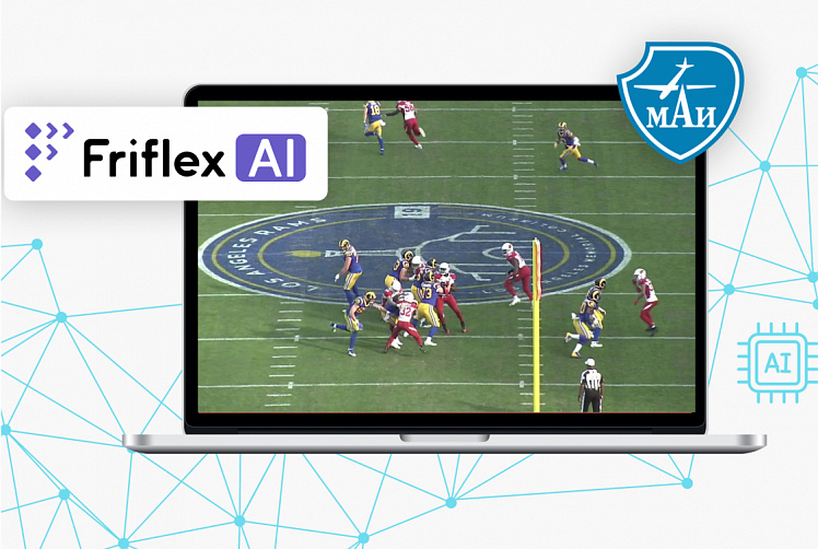
The largest Flutter application. 10+ million users

Mobile Application for Investment Platform
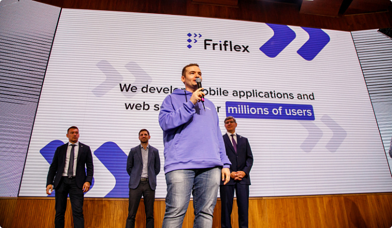
With a focus on cross-platform development and Flutter
We will write clean, easily expandable and supported code for different platforms. Let's create an application that will be used by millions of users
UI/UX, design prototyping
Create an efficient interface that is convenient and understandable to your user
Optimization of development time and efficiency
We will ensure the reliability of the services
Building Business Solutions with Machine Learning Algorithms
We will develop technological AI solutions for the future
Friflex specialists for your team
We will strengthen your IT team with our specialists
Data analysis
We will study in detail the context, market, problem and offer the best solution
Verification of IT products
We will check everything, explain and suggest how to fix it
Development and launch of the first version of the product on the market
We will provide a team and help to develop a product with the minimum functionality necessary for market launch
Web & Backend, Frontend development
We will develop an effective website for your users, find the best solution for combining technology and usability

Starting to cooperate with Friflex, we quickly and qualitatively solved a very important task – we "digitized" the process of issuing electronic policies for different categories of customers. Friflex has established itself as a reliable IT partner. We continue to collaborate with the company on other projects, including mobile development.
 General Director of EnergoGarant Insurance Company
"This is not the first time we have partnered with Friflex. The guys have proven their professionalism in mobile development. They completed the project on time. The team was constantly in touch and all current issues were resolved promptly. I would like to note the strong analytics and effective architectural solutions that helped quickly launch MVP. We continue to cooperate and recommend Friflex as professionals".
 CTO and co-founder of Whizz
"We turned to Friflex with a task from the HR department — to create an effective mobile communication channel of the company with employees. Friflex worked proactively, professionally and smoothly, ahead of the deadlines laid down in the roadmap. An internal platform has been developed and launched from scratch in three months. We continue to cooperate with Friflex to launch new features."
 Product owner
"Considering the situation with the growing demand for digital solutions, we wanted to create not just an application, but a kind of "store in your pocket" to help customers shop. And in close partnership with Friflex we have succeeded.
Полезные статьи о разработке для бизнеса